Yuuma

Project: Branding & Beverage Label


Scope of Work

  • Name

  • Logo

  • Beverage Label


Story

Yuuma is a Kombucha brewing company. They have two flavors but are looking to expand their flavor selection in the future.

Mission

To encourage younger adults to drink healthier. They want to introduce their beverage nationwide in most, if not all, grocery stores.


Logo

Sketching

First, I chose the name Yuuma. The name sounds fantastic, and it has many meanings, two of them being superiority and truth.

In the sketching process, I have heavily leaned towards tea leaves. Reasoning, Kombucha means fermented tea in Chinese.

 
Graphic Design Brainstorming
 

For the logo, I had one direction in mind. Minimalistic.

With research, I found that nobody uses a minimalistic approach. All of the kombucha brands are busy and full of information. It allows me to fill in that marketing gap.


Solution

Minimalistic, clean, and having students & young adults as the target audience.


Digital

I came up with three logo concepts.

  • A Clean minimal stacked version.

  • Tea leaf being the focal point

  • Overlapping letters to convey truth.

 
Logo Concepts
 

I attempted a few ideas to showcase the leaf and make it a branding element. However, after making a few drafts, I scrapped the idea because it quickly became a busy logo, which could be grouped in any other sub-par logo category.

Logomark Drafts


Final

When I came to the final variation, I knew that I designed the perfect fit. Minimal. Clean. And A hint of a leaf in y.

Color

Simple black and white, they can match with any flavor they decide to come up with in the future.


Finalized Wordmark


Beverage label

Sketching

Sketching the label was a fun process. Being minimal yet compacting all of the necessary information on top of health benefit icons.

I also managed to sneak a leaf shape into the elegant curve design. (Top right)

Not all sketches are pretty.


Digital

Once I went digital, everything started feeling right. With my first draft, I had a few errors. And the logo was one iteration before the final.

I have also had a lot of fun designing the icons for health benefits. While they could use some re-work to feel like a family, I still think I did great for my first icon family.

Color

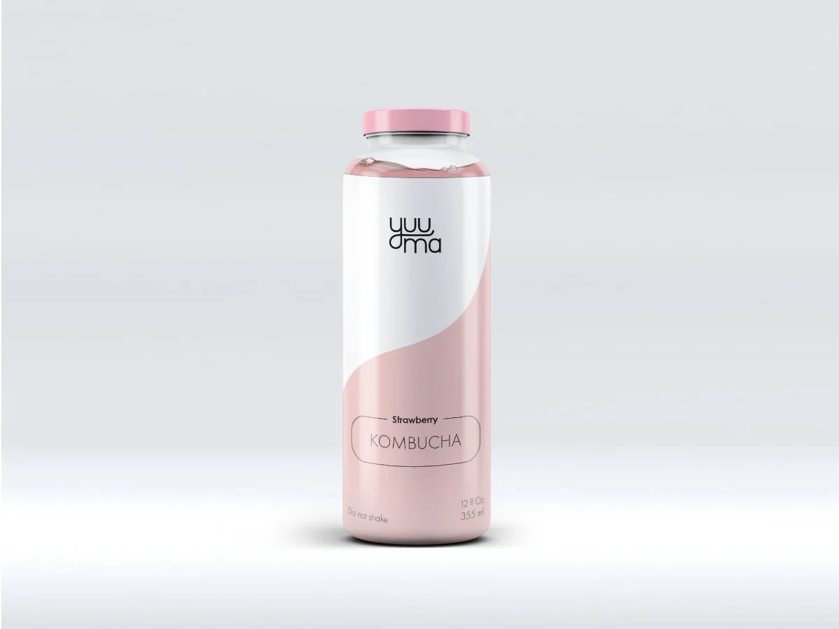
And lastly, the color use is very versatile. My idea was to use a muted color of the fruit, which Yuuma wants to represent. Green tea is green, strawberry red, etc.,


Digital - Final

In the final label, everything came together.

Minimal and organized layout.

Final Design for Print


Proof of Concept

Proof Of Concept
Iteration for Proof of Concept
Back of Mockup item


What I learned

I loved working on this project because it allowed me to work with something new.

It was also a great challenge to push a minimalistic style. I found my love and appreciation for minimalistic artists.

 
Previous
Previous

Centauri - Branding & Guidelines

Next
Next

Unmasked - Conference Branding