AquaDome

Project: Logo & Branding


Scope of Work

  • A new Logo.

  • Promotional Items

  • Signage


Story

AquaDome is a small store with tropical fish located in South Austin, TX. Fonded by Gary, and expanded into a small group of professionals.

Aqua Dome got its name naturally from its structure. The structure is an actual Dome!

Mission

AquaDome's mission is to sell healthy fish and educate new aquarium enthusiasts. They sell everything needed to have a healthy aquarium.


I am rebranding AquaDome because they need some major revamping in marketing. It is a fantastic store, but it has no branding, making it difficult to reach an audience.


Logo

Sketching

With my research, I have seen many playful logos with pet stores. PetCo is one of the examples. I went in a similar direction, where the logo would be literal and playful. Especially with their broad target audience, but focusing on children fascinated by moving fish in an aquarium.


The main two things that I wanted to convey in the logo are friendliness and literal fish for the fish store.


Solution

A typeface that is bold and playful (Berlin Sans FB)

Making a sea creature as the logo. And creating branding elements out of it.


Digital

The first draft was one hit and two misses. In black and white, only the seahorse looks usable. The other two are drifting too much into dead fish and a beach logo.


Final

With that much exploration, I have had a lot of misses. Re-thinking my decisions. I was too narrow-minded with my flow of ideas. However, I was lucky with the seahorse, which ended up being a great logomark. Lots of finessing went into the logo, and I learned to use a pen tool more efficiently.

Color

I went simple with a light blue, taken from one of the aquariums at their store. And I combined the blue with a gray, taken from their dome.


Signage & Branding

Sketching

It was a fun exploration, and I have learned that it matters a lot what type of items you brand. My idea was going simple with a mug and Tupperware container.

However, after some feedback, I realized how bad this idea was. Nobody wants to think of an aquarium when storing any food. Or think of aquarium water when drinking.

So I decided to go an extra step and design a fish food container and a few more signage.


Digital - Final

Creating a visual identity for a store I frequently visited was a lot of fun. If this is what I could do everyday, I would be happy :)


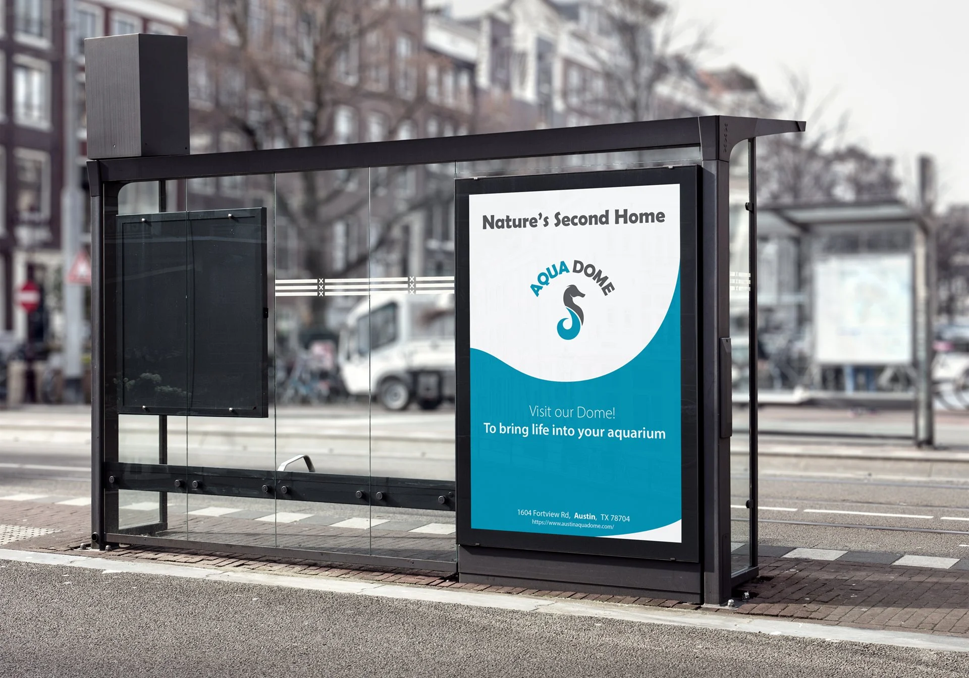
Bus Stop Signage


Food Container - Front

Food Container - Back


Proof of Concept


What I learned

The big thing that I have learned is sticking with the theme of branding. Do NEVER miss representing a store, or it could cost you a lot of money in the long run.

And to be more creative and do more word mapping or mind mapping before the sketching process.

 
Previous
Previous

Unmasked - Conference Branding